01
Existing foundation
Start from a model users already understood.
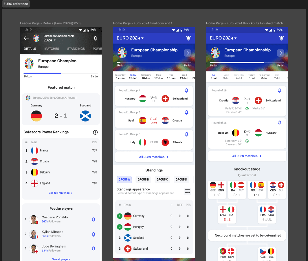
The EURO tournament page provided a familiar structural baseline for navigation, competition content and established behaviours.
Exploration
Case study 02
Sofascore · FIFA World Cup
FIFA World Cup 2026
I designed a central tournament destination that remained relevant as matches, expectations and fan priorities changed throughout the FIFA World Cup.
Tournament context, nearby matches, personalised content and knockout progression came together inside one evolving hub across iOS, Android and web.
Ownership
Sole designer
Across the tournament product experience
Delivery status
Shipped
Live throughout the FIFA World Cup
Feature adoption
26.8%
of Sofascore DAU opened the Featured tab
Feature engagement
56%
of Featured tab users engaged with Team Spotlight
Feature-specific internal analytics from the tournament period. Platform-wide tournament reach is presented separately in the Outcome section.
The challenge
Every match changed the table, eliminated teams and shifted attention towards a new part of the competition.
The challenge was not creating another tournament hub. It was building an experience that could stay relevant from the build-up to the opening match through to the final and beyond.
The solution came down to three product decisions.
Decision 01
Build on familiarity
Sofascore already had tournament hubs for competitions such as EURO and AFCON. Users understood their structure, navigation and core behaviours.
Instead of redesigning what already worked, we evolved that foundation and focused our effort on the areas where the FIFA World Cup introduced genuinely different needs.
Structuring the experience
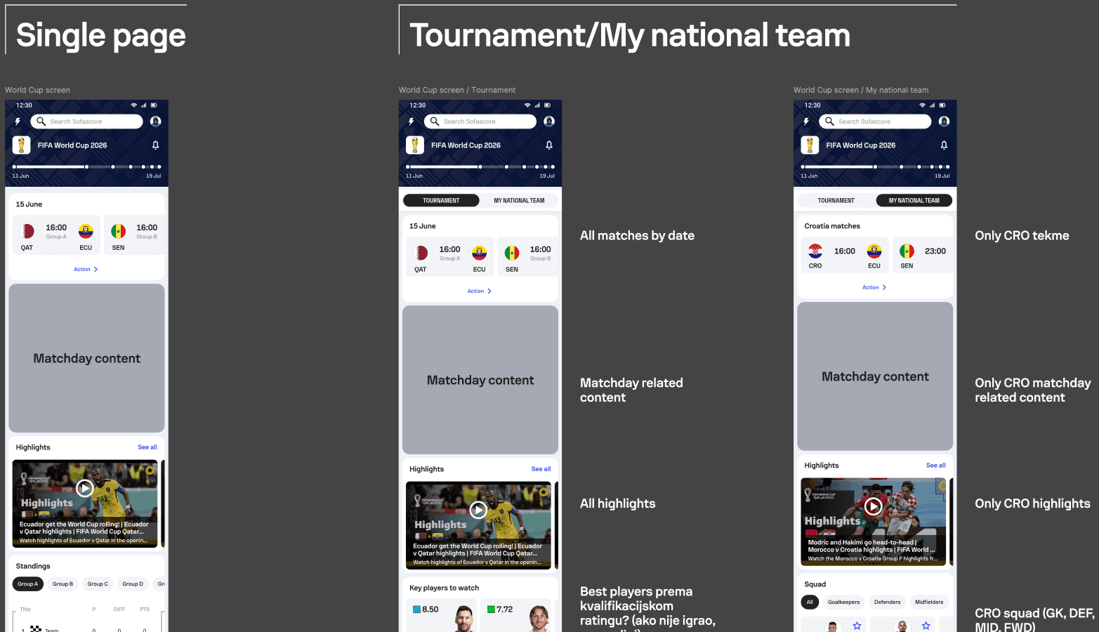
We started from tournament patterns that Sofascore users already understood. Early concepts kept all content inside one continuous page, but that approach struggled to balance the wider competition with the national team each fan cared about.
Separating Tournament and My National Team created a clearer hierarchy. It preserved a shared destination for the competition while giving personalised content enough space to become genuinely useful.
Existing foundation
The EURO tournament page provided a familiar structural baseline for navigation, competition content and established behaviours.
Exploration
Explore the hierarchy
Early explorations compared a single long destination with a structure that separated shared tournament content from national-team personalisation.
Exploration
Define the states
The structure needed to work when no country had been selected and then become meaningfully more relevant once a fan chose their national team.
Exploration
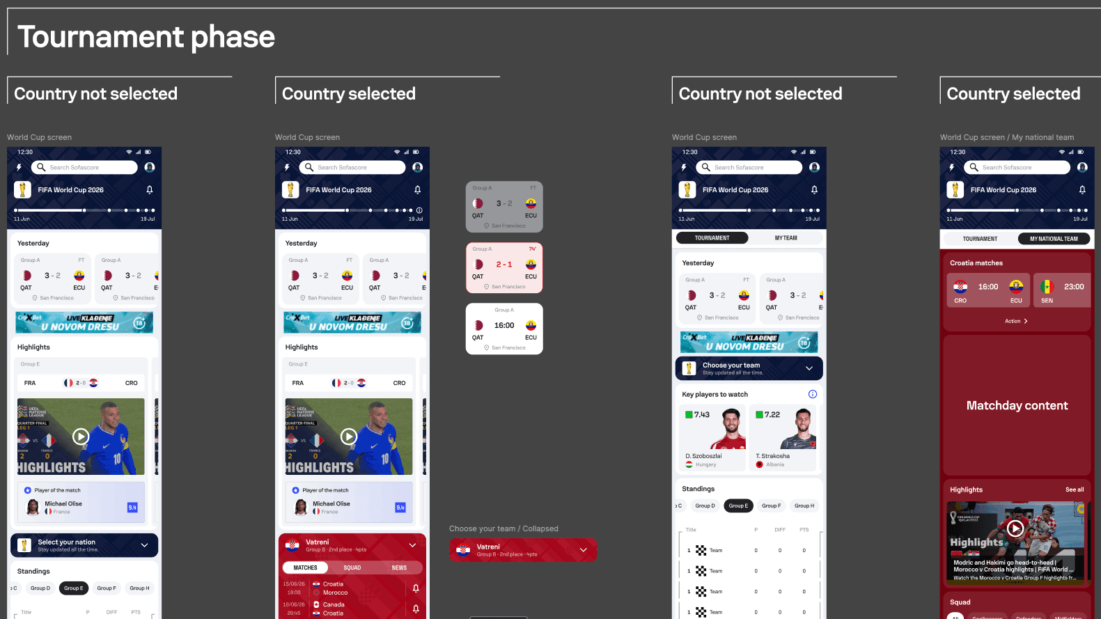
From the existing EURO model to a dedicated tournament and national-team structure.
Product takeaway
The key change was not adding another feature. It was deciding which content belonged to the tournament and which belonged to the fan.
Decision 02
Stay relevant
As the tournament progressed, matches changed what fans cared about. The experience needed to continuously bring the current tournament moment to the surface.
The timeline provided context, the daily schedule focused attention on nearby matches, My National Team gave fans a personalised entry point and the bracket made the path towards the final easier to understand.
Daily relevance
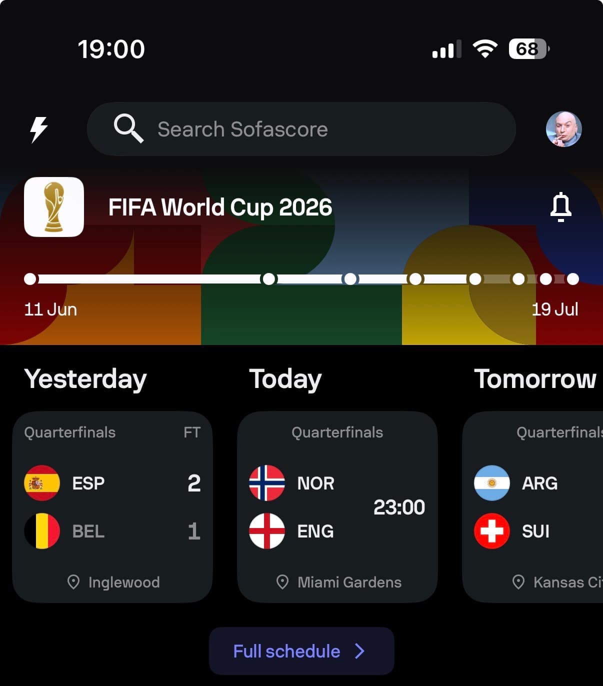
Yesterday, Today and Tomorrow kept the experience focused on nearby matches without removing access to the complete tournament schedule.
Personalisation
My National Team brought relevant matches, players and content into one focused overview connected to the wider competition.
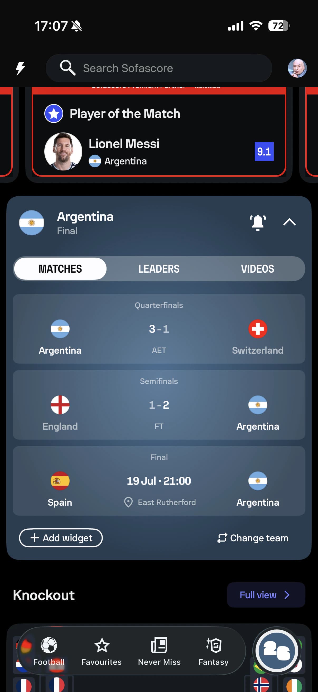
Tournament context
The timeline provided immediate orientation, while the compact bracket made the expanded knockout format easier to follow.
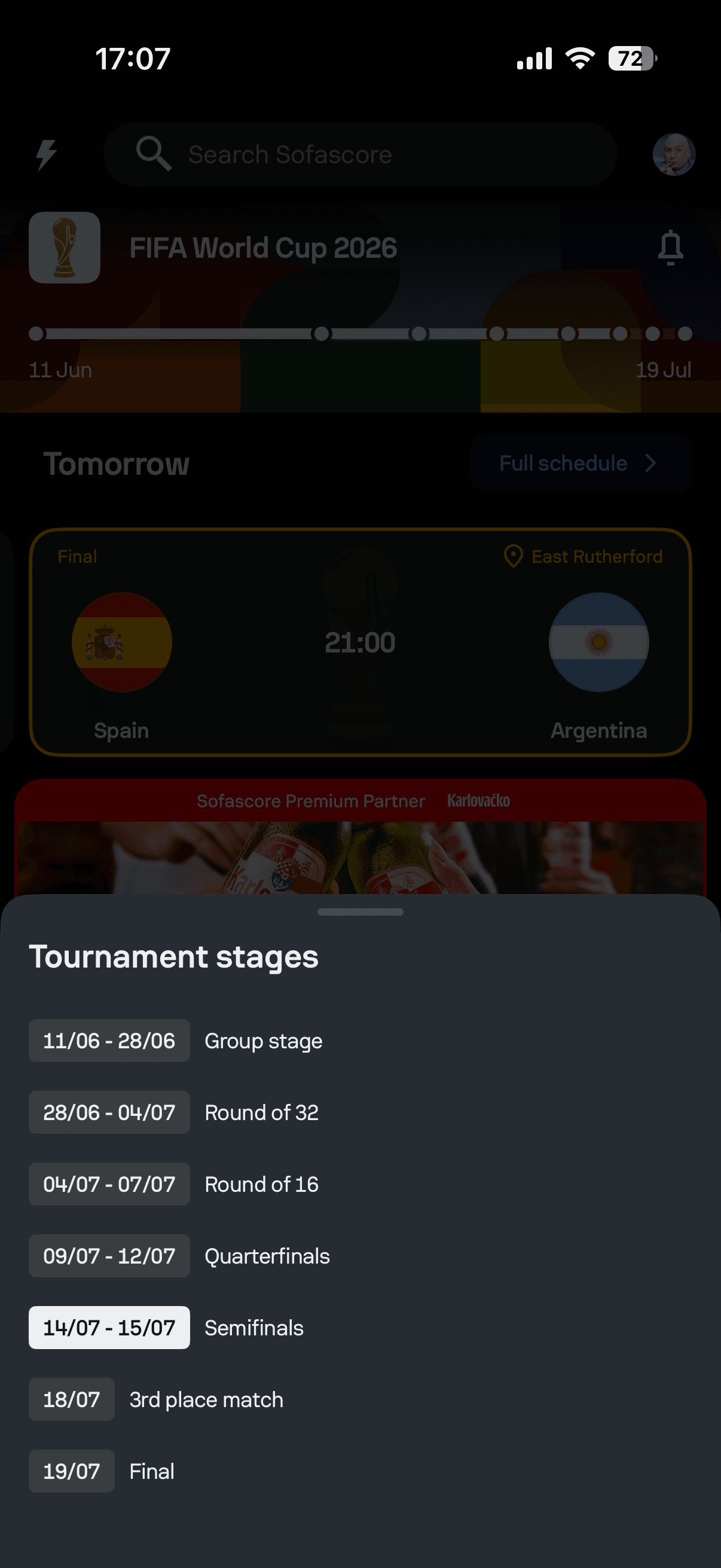
Swipe through principles
Daily relevance
Yesterday, Today and Tomorrow kept the experience focused on nearby matches without removing access to the complete tournament schedule.
Personalisation
My National Team brought relevant matches, players and content into one focused overview connected to the wider competition.
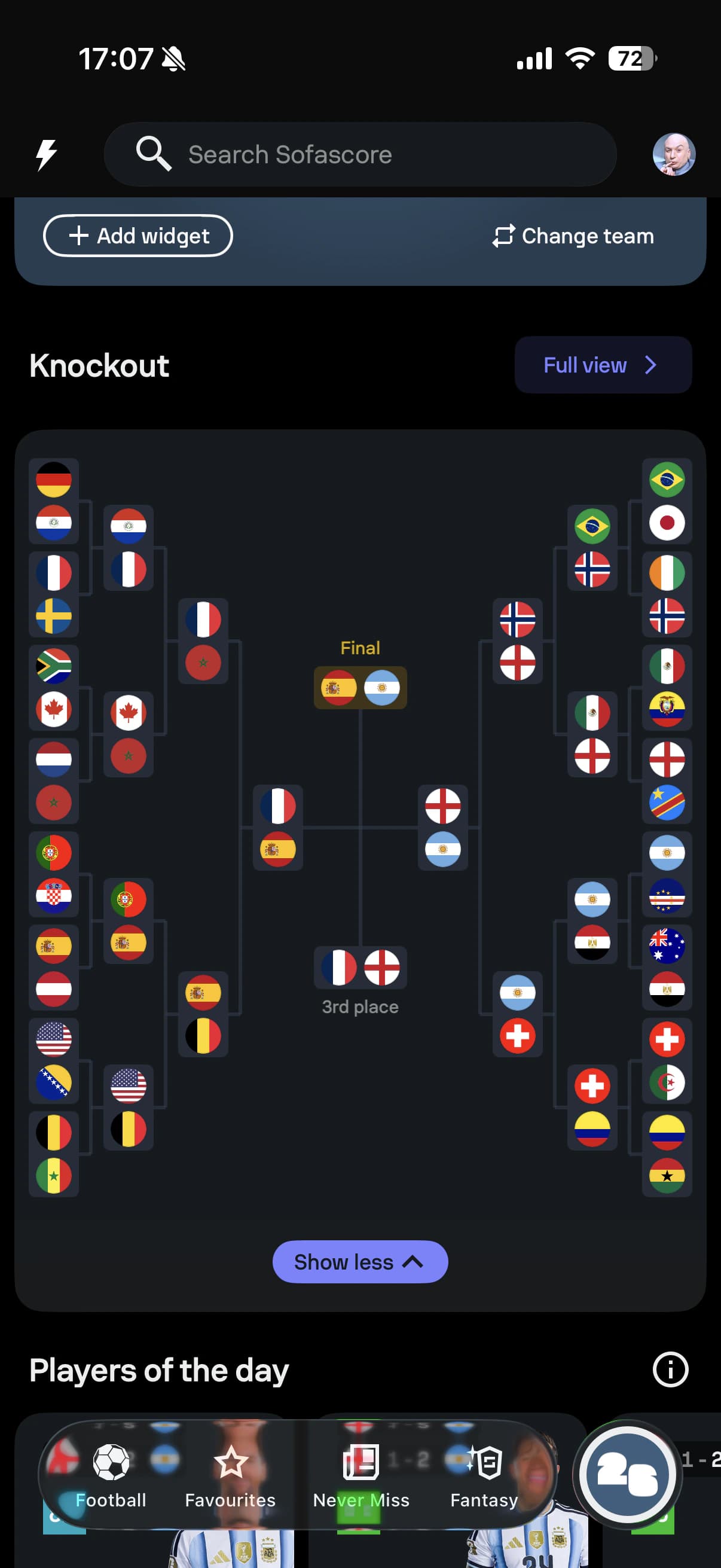
Tournament context
The timeline provided immediate orientation, while the compact bracket made the expanded knockout format easier to follow.
Product principle
The experience balanced what mattered now, what mattered personally and where the tournament was heading.
Personalisation explorations
The experience began with a simple question: how should fans choose their team, and what should happen after they do? We explored entry points, content depth and different ways of organising national-team information.
The challenge was giving fans meaningful context without recreating an entire team page inside the tournament hub or introducing another long, nested browsing experience.
Entry point exploration
The empty state needed to make the value of personalisation clear before asking fans to choose a team. We explored different messages and visual treatments for that first interaction.
Exploration

Content exploration
Explorations combined matches, squad information, leaders and changing matchday states. They revealed how quickly the module could become too complex or begin behaving like a second team page.
Exploration
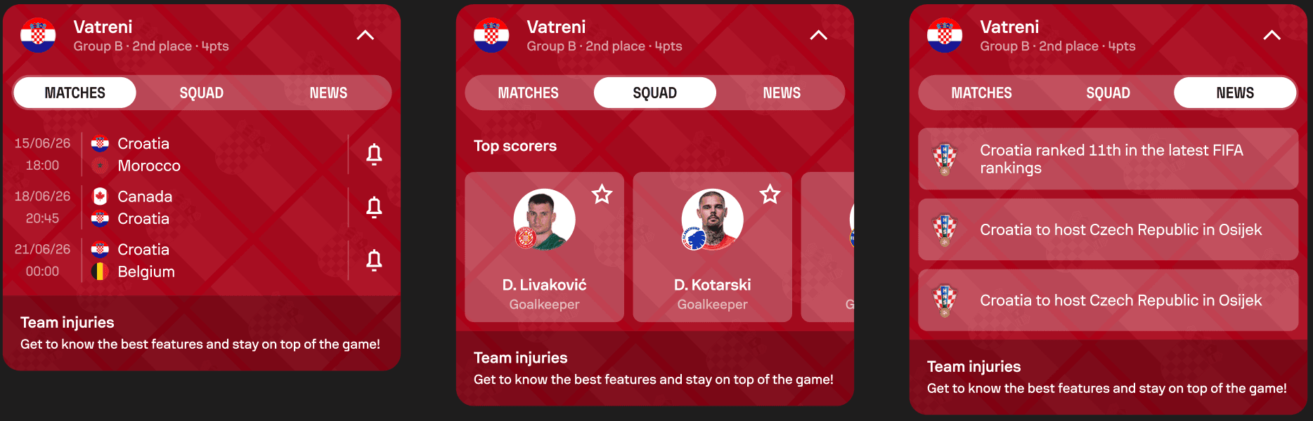
Selected direction
The selected direction treated My National Team as a modular overview: enough context to support the tournament journey, with clear paths into deeper match, team and player experiences.
Chosen outcome
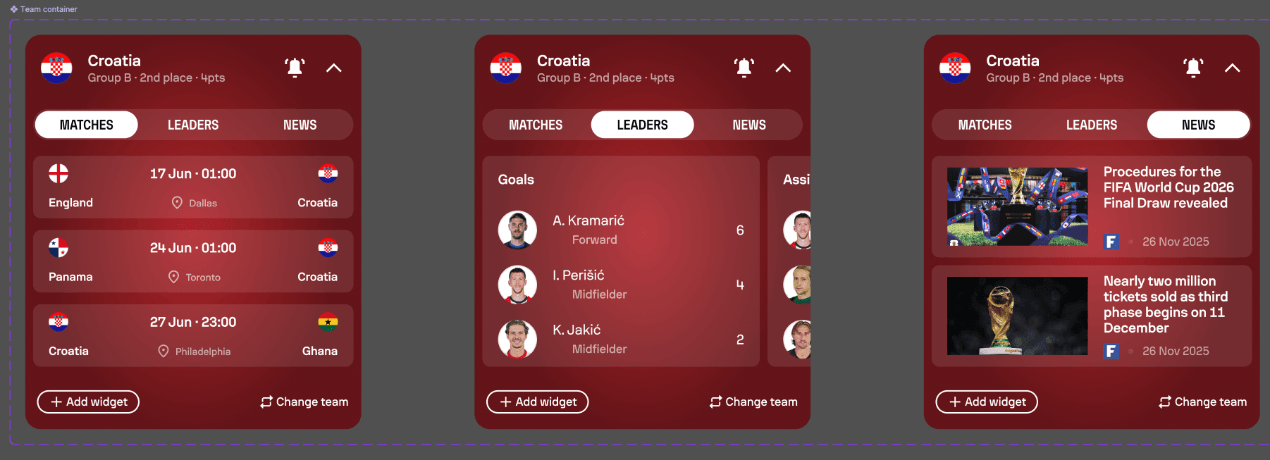
Entry-point and content explorations led to a focused modular experience that reduced effort instead of simply exposing more information.
Designing for a new format
The expanded tournament introduced more teams, more rounds and significantly more information than previous formats. A complete bracket could no longer be reduced to a single dense mobile view without compromising legibility.
The process moved through several explorations before arriving at the final direction: a compact bracket embedded inside the main hub, with a dedicated full view available when fans wanted the complete knockout story.
Early exploration
This direction made the full Round of 32 visible at once, but it also exposed the core limitation: the expanded format created too much visual density for one readable mobile layout.
Exploration
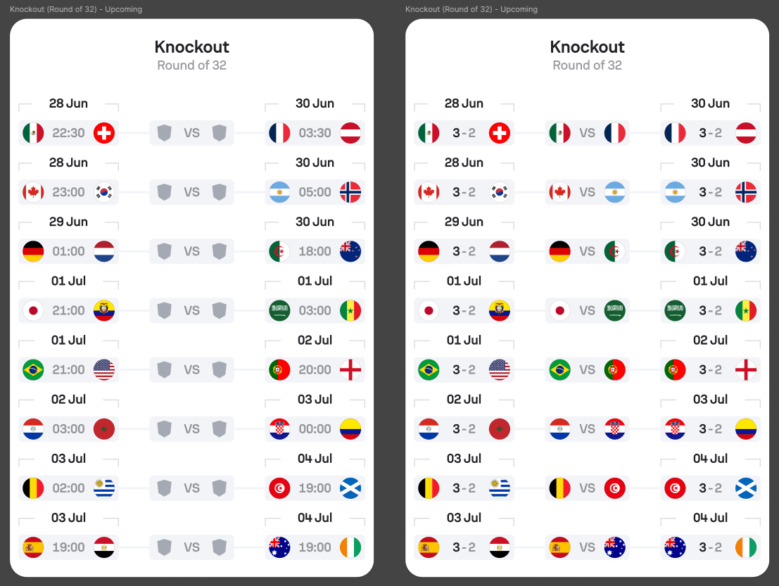
Structure exploration
The populated Path A and Path B model tested whether a split structure could support real teams, results, finalists and the third-place match while keeping progression understandable.
Exploration
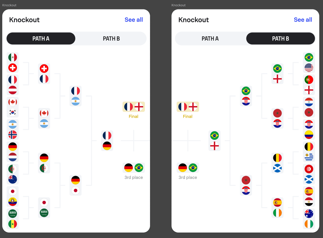
Final solution
The final product used a compact bracket inside the main hub to provide immediate tournament orientation, while the complete knockout view remained available through a dedicated entry point.
Chosen outcome
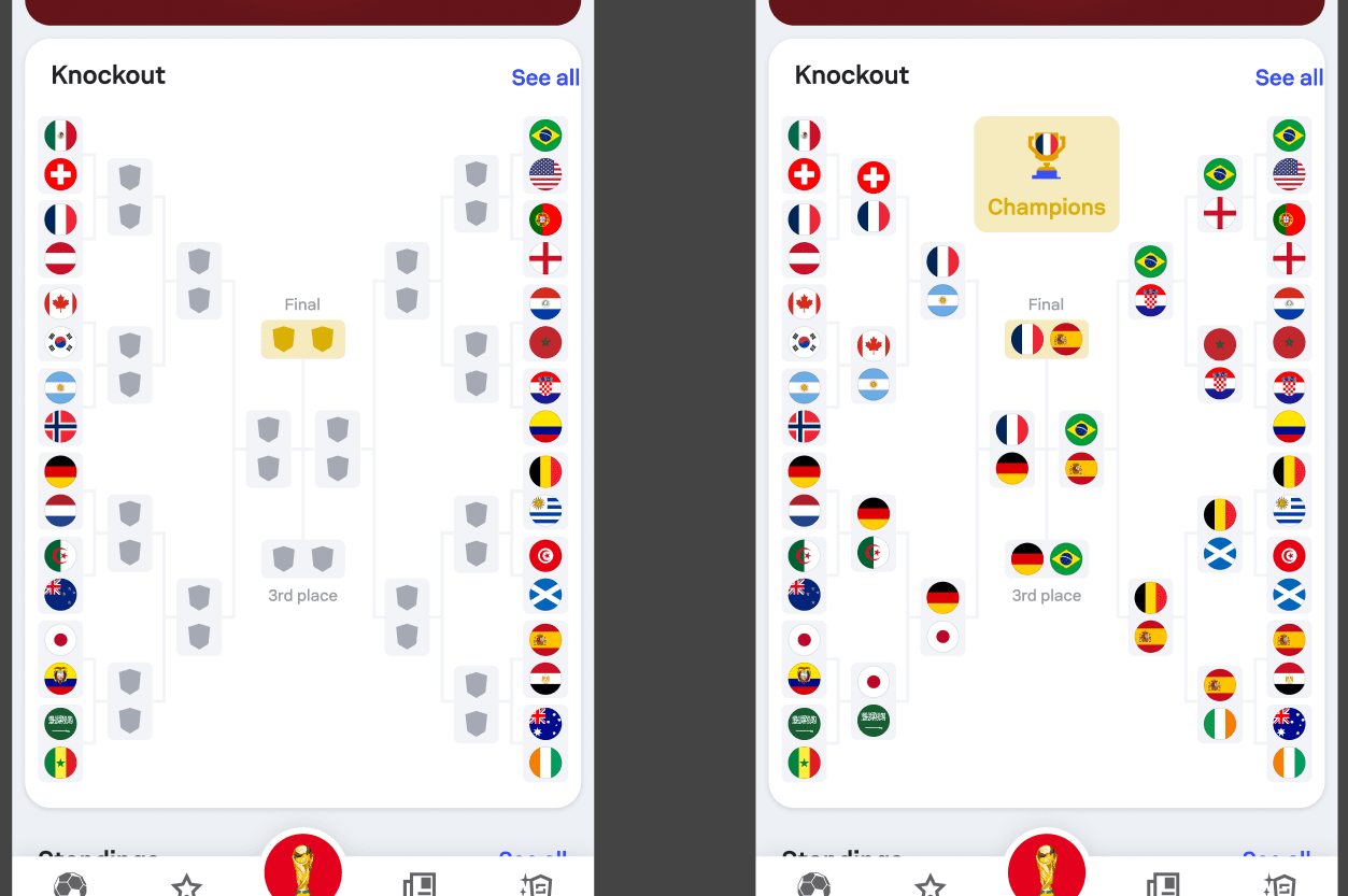
Full-bracket explorations led to a compact in-hub solution supported by a dedicated detailed view.
Product takeaway
The winning solution separated overview from detail: enough progression in the hub to stay oriented, and the full bracket only when users chose to explore it.
The hub in motion
The World Cup hub combined the daily schedule, match highlights, personalised national team content, knockout progression and tournament storytelling inside one continuous experience.
Rather than exposing every feature with equal priority, the hierarchy guided fans from what was happening now towards the wider context of the competition.
Tournament orientation
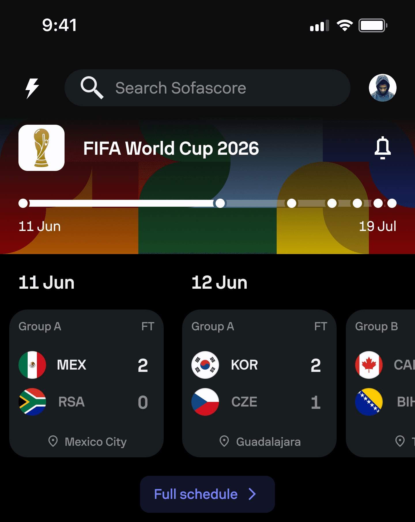
The header and timeline gave fans immediate orientation before they moved into matches, standings and deeper content.
Daily relevance
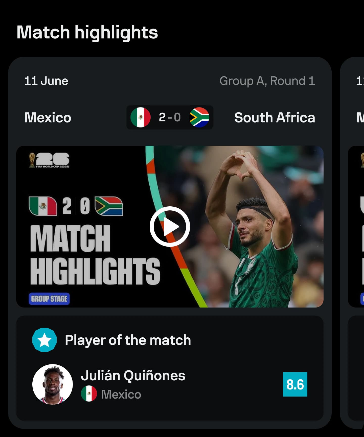
Nearby fixtures and highlights reduced the effort needed to understand what had just happened, what mattered today and what was coming next.
My National Team
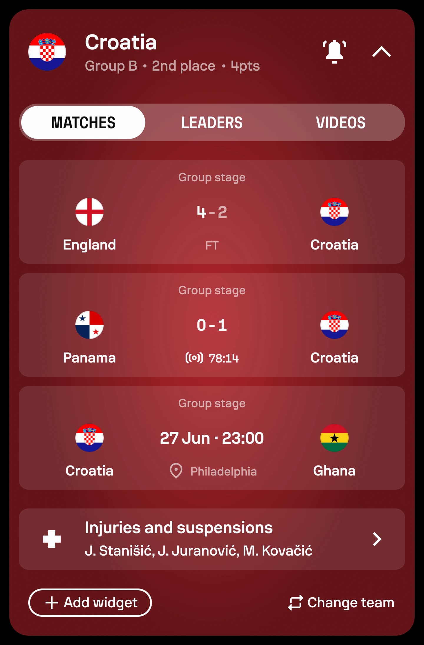
The personalised team container brought relevant matches and content into the wider tournament experience without forcing fans to leave the hub.
Knockout progression
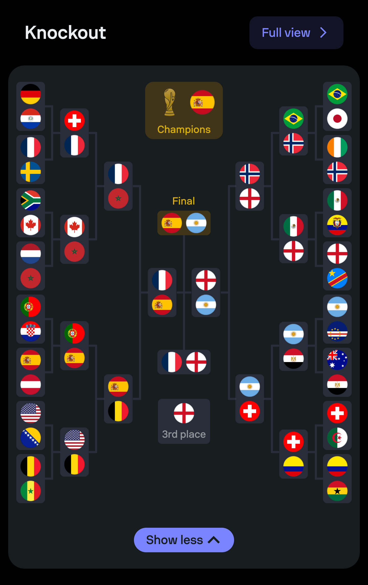
The compact bracket preserved tournament progression on a small screen while opening the complete Round of 32 story when fans wanted more detail.
Players and leaders
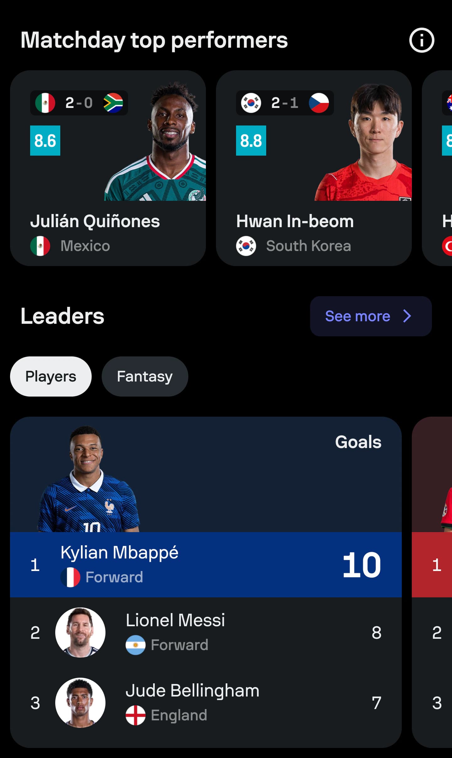
Top performers and leader modules helped the hub go beyond immediate utility and encouraged fans to explore the players shaping the competition.
Tournament stories
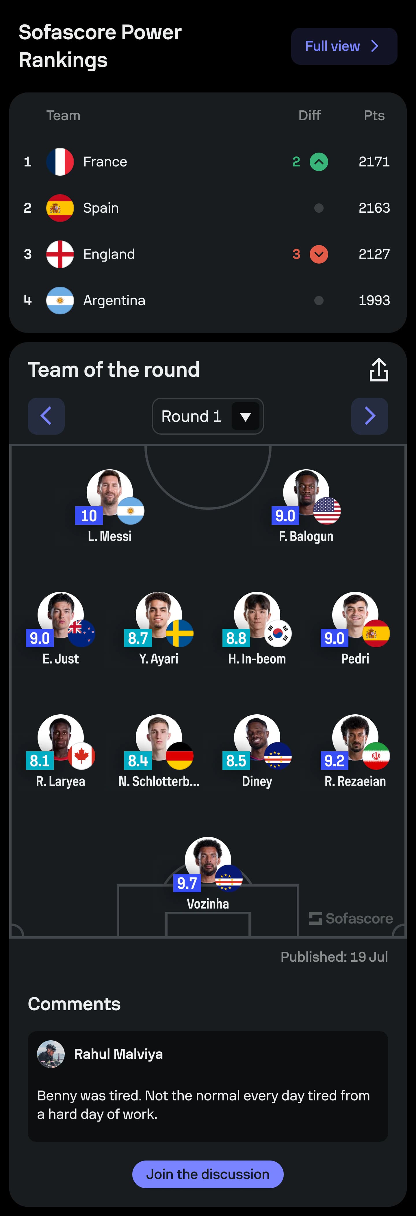
Power Rankings and Team of the Round translated tournament performance into clear, scannable summaries that rewarded repeat visits.
Media and community
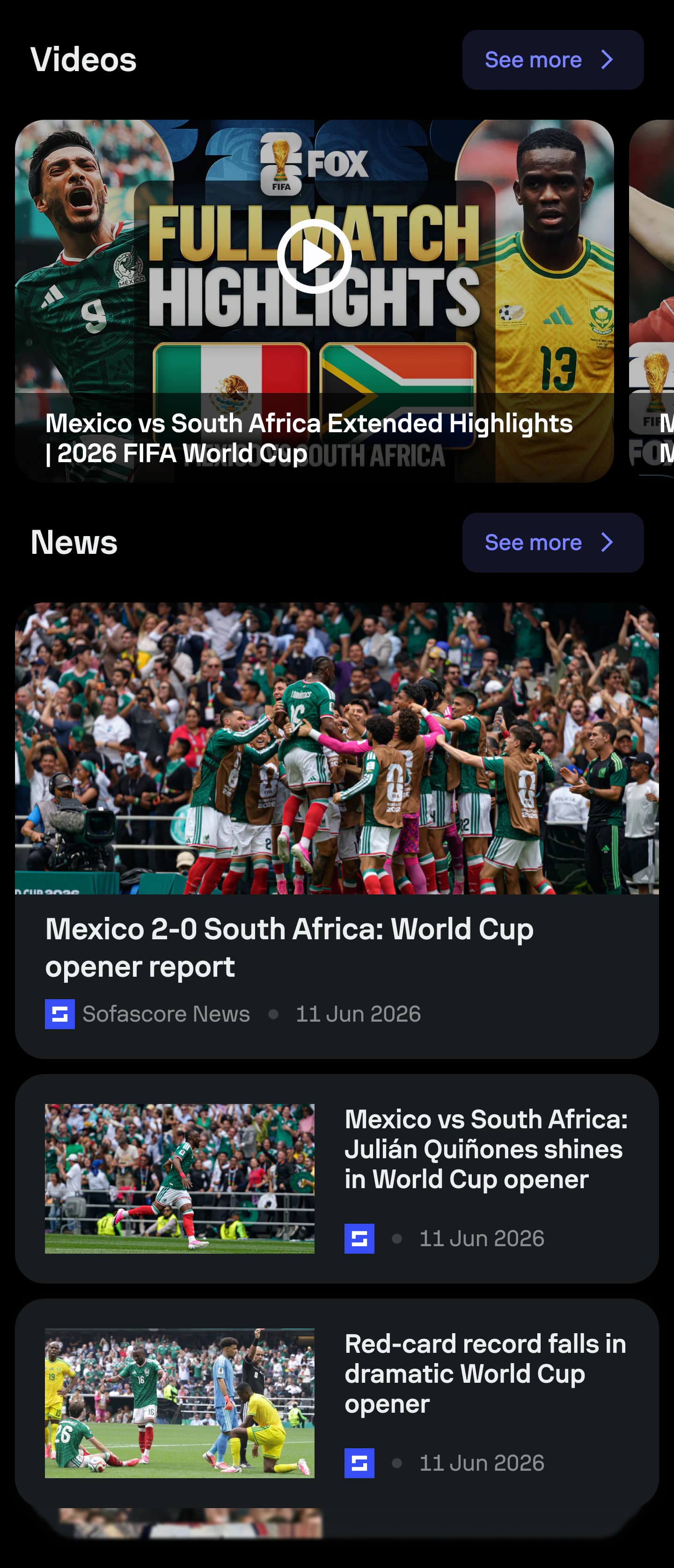
Comments, videos and news helped the hub evolve from match utility into a broader destination for discovery and tournament storytelling.
Swipe through experience
Key takeaway
The hub stayed relevant not by adding more at every step, but by shifting the right information and content into view as the tournament evolved.
An evolving destination
Tournament lifecycle
Build-up
Education, anticipation and choosing a national team.
Live tournament
Nearby matches, highlights and daily relevance.
Knockout stage
Progression, leaders and the path towards the final.
After the final
Winner, completed bracket and tournament closure.
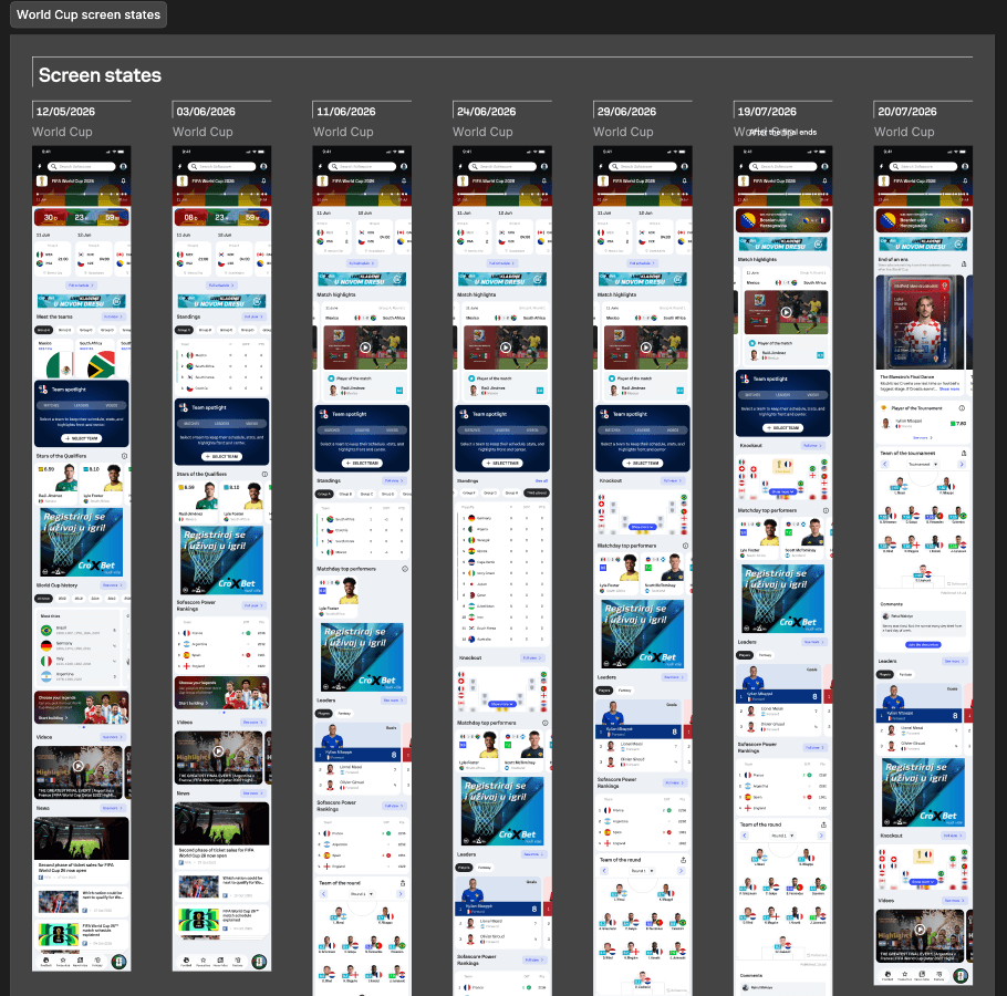
Build-up
Education, anticipation and choosing a national team.
Live tournament
Nearby matches, highlights and daily relevance.
Knockout stage
Progression, leaders and the path towards the final.
After the final
Winner, completed bracket and tournament closure.
The destination remained familiar while its hierarchy evolved with the stage of the tournament.
After the final whistle
The tournament's defining match
Its scale made the closing state more than a visual celebration. It became the most important transition from live competition to tournament history.
34.4M
Match openings
8.3M
Users following the final
A clear ending
The final state surfaced the champion, final result and key match content as the strongest closure moment.
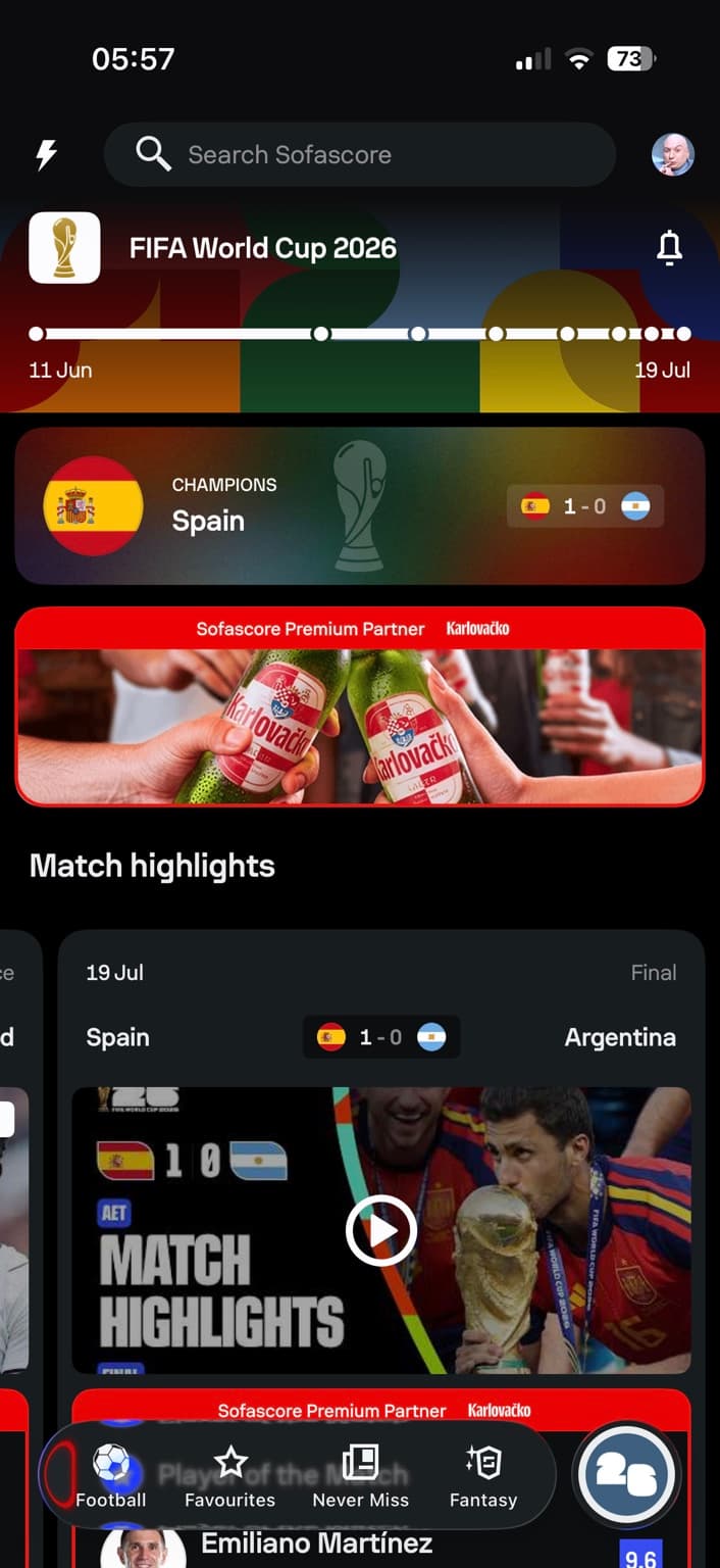
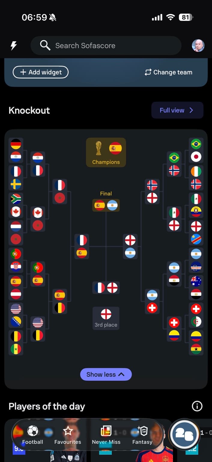
The full journey
The bracket became a visual record of the complete path from the Round of 32 to the final.
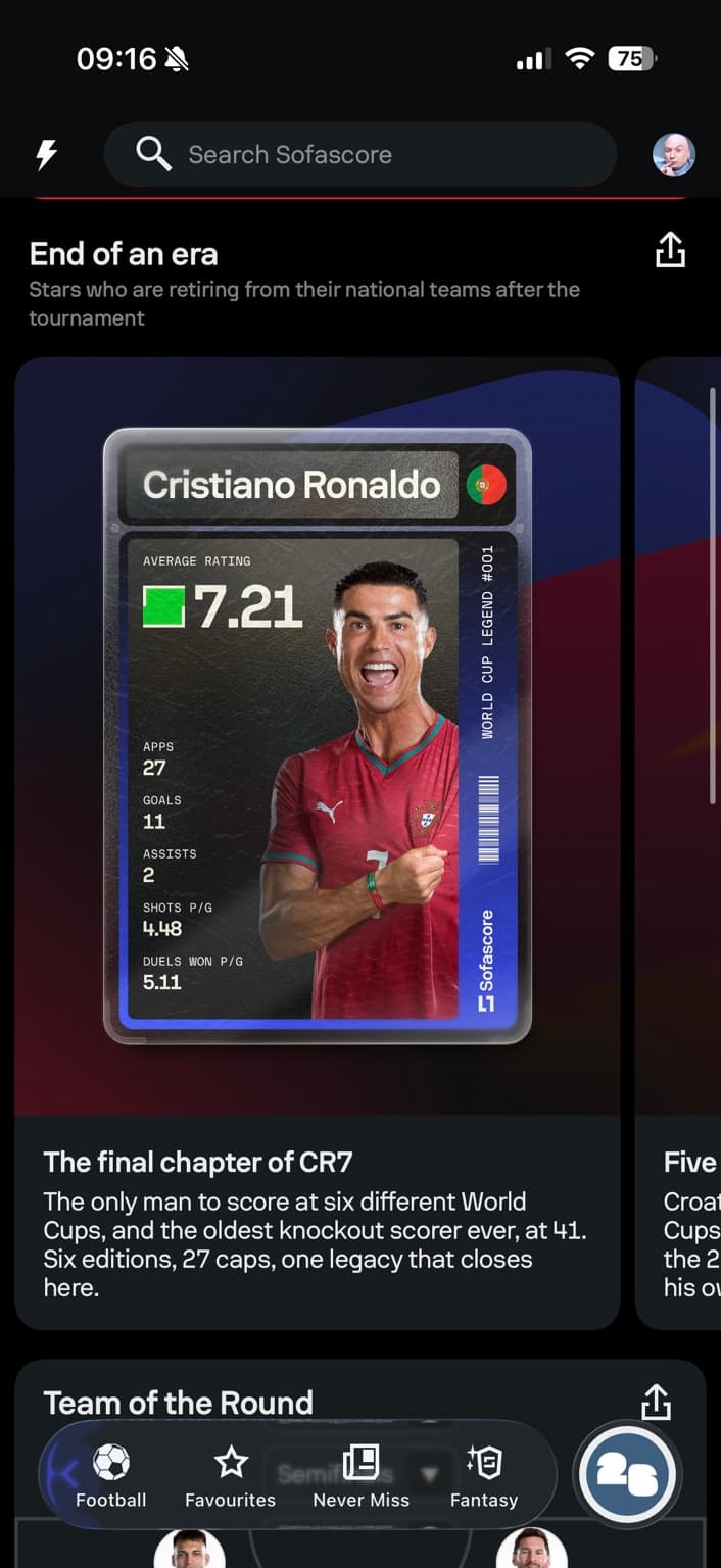
Beyond the final
End-of-an-era stories and final highlights extended the experience beyond live scores and results.
Swipe through closing states
One final result became a complete record of how the tournament unfolded.
Decision 03
Keep it focused
Designing for a live tournament meant balancing user value, implementation effort and fixed delivery deadlines across iOS, Android and web.
When an idea did not strengthen the core tournament journey enough to justify its cost, we left it outside the critical path.
Shipping the right product mattered more than shipping every idea.
Outcome
The World Cup became one of Sofascore's largest product moments, combining global reach with meaningful engagement inside the dedicated tournament experience.
Featured tab adoption and Team Spotlight engagement are the product signals. Platform-wide figures provide tournament scale, not direct design attribution.
Feature-specific product signals
26.8%
of Sofascore daily active users opened the Featured tab
56%
of Featured tab users engaged with Team Spotlight
Platform-wide tournament context
51.4M
Active users during the FIFA World Cup
2B
World Cup screen openings across the tournament
5.9M
New installs during the same period
Featured tab and Team Spotlight figures reflect internal product analytics. Platform-wide figures are based on Sofascore's post-tournament reporting.
